2.6.1.2. Interpretation of PCA results
The first result that one should consider is the non-zero eigenvalues (so the variance of the
corresponding principal components). These values are stored in a specific ntuple, that can be
retrieve by calling the method getResultNtupleD(). This ntuple contains three
kind of information: the eigenvalues itself (“eigen”), these values as contributions in percent of
the sum of eigenvalues (“eigen_pct”) and the sum of these contributions (“sum_eigen_pct”). All
these values can be accessed through the usual Scan method (see
Macro “dataserverPCAExample.py” to see the results).
The following lines are showing how to represent the eigenvalues as plots and the results are gathered in Figure 2.55. From this figure, one can easily conclude that only the three first principal components are useful (as it reached an inertia of a bit more than 99% of the original one). This is the solution chosen for the rest of the graphical representations below and this is the first nice results from this step: it is possible to reduce the dimension of our problem from the 5 different subjects to the three principal component that needs to be explicated.
# Draw the eigen values in different normalisation
c = ROOT.TCanvas("cEigenValues", "Eigen Values Plot", 1100, 500)
apad3 = ROOT.TPad("apad3", "apad3", 0, 0.03, 1, 1)
apad3.Draw()
apad3.cd()
apad3.Divide(3, 1)
ntd = tpca.getResultNtupleD()
apad3.cd(1)
ntd.Draw("eigen:i", "", "lp")
apad3.cd(2)
ntd.Draw("eigen_pct:i", "", "lp")
ROOT.gPad.SetGrid()
apad3.cd(3)
ntd.Draw("sum_eigen_pct:i", "", "lp")
ROOT.gPad.SetGrid()
c.SaveAs("PCA_notes_musique_Eigen.png")
Figure 2.55 Representation of the eigenvalues (left) their overall contributions in percent (middle) and
the sum of the contributions (right) from the PCA analysis.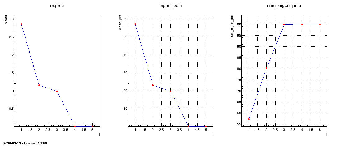
As stated previously, one can have a look at the variables in their usual representation (that can
be seen in Figure 2.56) that is called the correlation
circle. This plot is obtained by calling the drawLoading method that takes two arguments: the first
one being the number of the PC used as x-axis while the second one is the number of the PC used as
y-axis. The code to get Figure 2.56 is shown below:
# Draw all variable weight in PC definition
cLoading = ROOT.TCanvas("cLoading", "Loading Plot", 800, 800)
apad2 = ROOT.TPad("apad2", "apad2", 0, 0.03, 1, 1)
apad2.Draw()
apad2.cd()
apad2.Divide(2, 2)
apad2.cd(1)
tpca.drawLoading(1, 2)
apad2.cd(3)
tpca.drawLoading(1, 3)
apad2.cd(4)
tpca.drawLoading(2, 3)
Figure 2.56 represents the correlation between the original variable and the principal component under study. Two kinds of principal component are resulting from PCA:
the size one where all variables are on the same size of the principal component. In our case, the first PC in Figure 2.56 represents the variability of marks.
the shape one where variables are balanced from positive to negative value of the principal component. In our case, the second PC in Figure 2.56 represents the difference observed between scientific variables, such as maths and physics, from literary ones, such as french and latin.
Finally to complete the picture, the third PC is a shape one that represents the fact that music seems to have a very specific behaviour, different from all the other studies.
Figure 2.56 Representation of correlation between the original variables and the PC under study.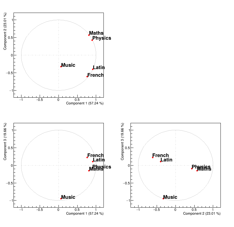
Finally, one can also have a look at the points distribution in the new PC space (that can be seen
in Figure 2.57). This plot is obtained by calling the method
drawPCA that takes two compulsory arguments: the first one being the number of the PC used as
x-axis while the second one is the number of the PC used as y-axis. An extra argument can be provided
that is used to specify a branch in the database that contains the name of the points (the name of
the pupils) which allows to get a nice final plot. The code to get
Figure 2.57 is shown below:
# Draw all point in PCA planes
cPCA = ROOT.TCanvas("cpca", "PCA", 800, 800)
apad1 = ROOT.TPad("apad1", "apad1", 0, 0.03, 1, 1)
apad1.Draw()
apad1.cd()
apad1.Divide(2, 2)
apad1.cd(1)
tpca.drawPCA(1, 2, "Pupil")
apad1.cd(3)
tpca.drawPCA(1, 3, "Pupil")
apad1.cd(4)
tpca.drawPCA(2, 3, "Pupil")
Figure 2.57 shows where to find our pupils with respect to our new basis and the interpretation of the correlation plot of the variable holds as well:
looking at PC1, it seems to be defined by two extremes, Jean and Monique, the former being bad at every subjects while the latter is good at (almost) all subjects.
looking at PC2, it also seems to be defined by two extremes, Pierre and Andre, the former having way better marks at literary subjects than at scientific ones while its the other way around for the latter.
looking at PC3, it seems to oppose Evelyn to all the other pupils, and this correspond to fact that every pupils is bad at music, but Evelyn.
Figure 2.57 Representation of the data points in the PC-defined plane.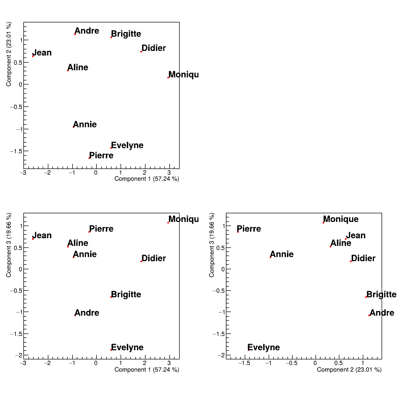
All these interpretations remain graphical and give an easy way to summarise the impact of the PCA analysis. Disregarding the sources considered (the variables or the points), one can have quantitative interpretation coefficients that detail more the “feeling” described above:
the quality of the representation: it shows how well the source (either the subject or the pupil in our case) is represented by a given PC. Summing these values over the PC should lead to 1 for every sources.
the contribution to axis: it shows how much the source (either the subject or the pupil in our case) contribute to the definition of the given PC. Summing these values over the source (for the given PC) should lead to 1 for every PC.
Example of how to get these numbers can be found in the use-case macros, see Macro “dataserverPCAExample.py”.