2.5.5. Graph 2D “profile”
It consists in partitioning the “x” axis with a number of bins and in plotting, for each segment, the mean value in blue and the standard deviation by a black line. The number of segments N is passed as an option with the formalism nclass=N. We can also visualise the scatterplot just below the profile plot, by adding the option “same” (resulting in the red points also shown in Figure 2.47).
tdsGeyser = DataServer.TDataServer("tdsgeyser", "Geyser database")
tdsGeyser.fileDataRead("geyser.dat")
tdsGeyser.drawProfile("x2:x1","","same")
Figure 2.47 Scatterplot between attributes x1 and x2 of the 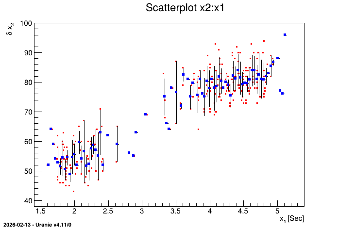
TDataServer geyser.