

Documentation
/ Manuel utilisateur en C++
: 
| II.5. Visualisation dedicated to uncertainties | ||
|---|---|---|
 | Chapter II. The DataServer module |  |
ROOT integrates many high level visualisation features, but some of them, devoted to statistics are missing. As
they are linked to data, it seemed relevant to develop them in this library. Many of the methods discussed throughout
this section are in any case, based on the original ROOT methods that produce plots from a
TTree-object: the TTree::Draw method (and subsequently the
TTree::Scan when dumping on screen the content of the TDataServer).
These tree arguments are the same on the TDataServer::drawTDataServer::scan
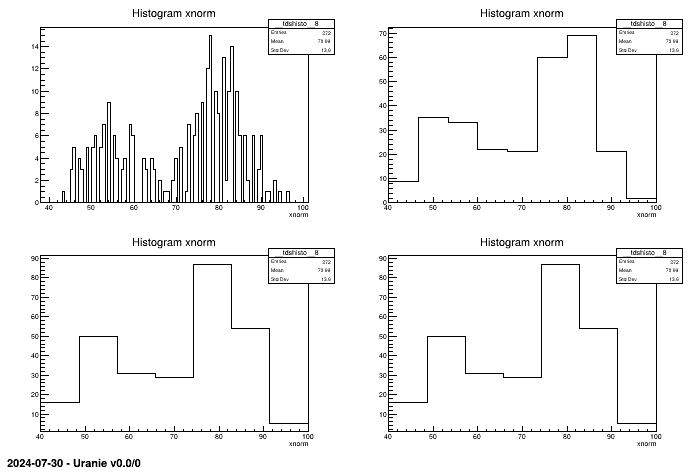
The histogram is present in ROOT but it needs to be encapsulated when the user wants to choose an automatic method
determining the number of bins. By default, the number of bins is given in the
variable of the configuration file of ROOT .rootrc of the directory
$ROOTSYS/etc.This information can be overloaded by an user file .rootrc in its
home directory ($HOME), or in a local file where ROOT is executed. Several methods exist to
determine the number of "bins" according to the characteristics of the variable to be visualised.
Again we consider the TDataServer built from the geyser.dat file, to which we add the attribute
xnorm, then the histograms will be plotted using the different methods of this new attribute.
TCanvas *c2 = new TCanvas();
c2->Divide(2,2);

TDataServer * tdsGeyser = new TDataServer("tdsgeyser", "Databae of the geyser");
tdsGeyser->fileDataRead("geyser.dat");
tdsGeyser->addAttribute("xnorm", "sqrt(x1*x1+x2*x2)");

c2->cd(1); tdsGeyser->draw("xnorm","","nclass=root");
c2->cd(2); tdsGeyser->draw("xnorm","","nclass=sturges");
c2->cd(3); tdsGeyser->draw("xnorm","","nclass=fd");
c2->cd(4); tdsGeyser->draw("xnorm","","nclass=scott");
Figure II.42. Different histograms of the same attribute xnorm depending on the method for computing bins. The values are respectively 100(root), 8 from sturges, 7 from fd and scoot.
tdsGeyser->drawBoxPlot("x2"); 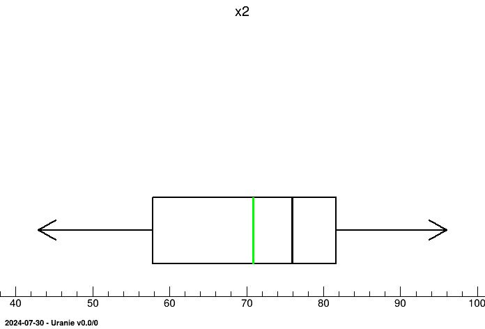
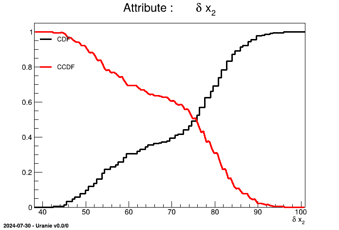
We can plot the graphs of CDF and/or CCDF.
tdsGeyser->drawCDF("x2");
tdsGeyser->drawCDF("x2","","ccdf"); 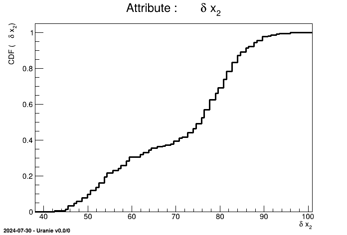
When a 2D scatterplot is plotted, we do not automatically see the number of points falling in the same cell. To get an assessment of this information, the contour levels of the number of points have to be put in background and then it becomes possible to plot the classical scatterplot.
TDataServer * tdsGeyser = new TDataServer("tdsgeyser", "Geyser database");
tdsGeyser->fileDataRead("geyser.dat");
tdsGeyser->drawScatterplot("x2:x1"); 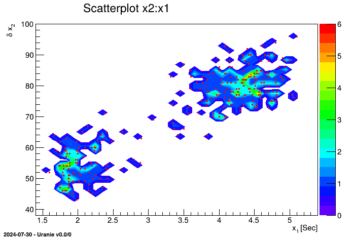
This figure has to be compared to the classical scatterplot shown, for instance, in Figure II.4.
It consists in partitioning the "x" axis with a number of bins and in plotting, for each segment, the mean value in blue and the standard deviation by a black line. The number of segments N is passed as an option with the formalism nclass=N. We can also visualise the scatterplot just below the profile plot, by adding the option "same" (resulting in the red points also shown in Figure II.47).
TDataServer * tdsGeyser = new TDataServer("tdsgeyser", "Geyser database");
tdsGeyser->fileDataRead("geyser.dat");
tdsGeyser->drawProfile("x2:x1","","same"); 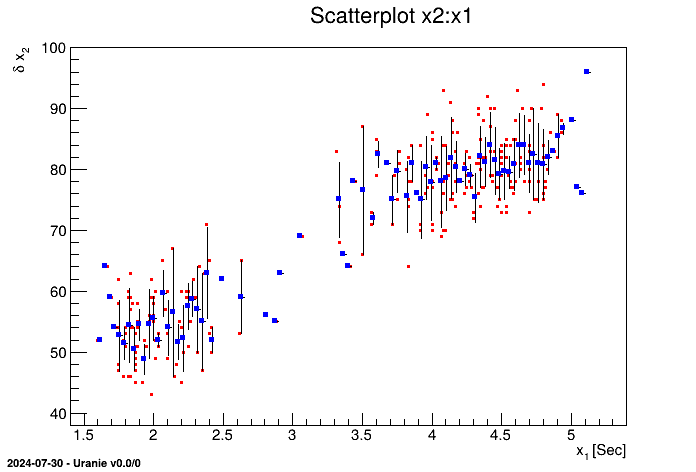
This 2D graph consists in plotting the scatterplot of the two attributes , and also plotting each of the two histograms of the attributes in X and Y, respectively below or on the left of the scatterplot.
TDataServer * tdsGeyser = new TDataServer("tdsgeyser", "Database of the geyser");
tdsGeyser->fileDataRead("geyser.dat");
tdsGeyser->drawTufte("x2:x1"); 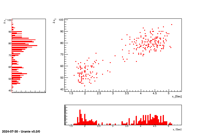
This 2D graph consists in creating a matrix of graphs, where for the (i,j) cells with i different from j, the graph contains the scatterplot of the attribute j versus the attribute i, and for cell (i,i), the graph contains the histogram of the attribute i.
TDataServer * tdsGeyser = new TDataServer("tdsgeyser", "Database of the geyser");
tdsGeyser->fileDataRead("flowrateUniformDesign.dat");
tdsGeyser->drawPairs(); 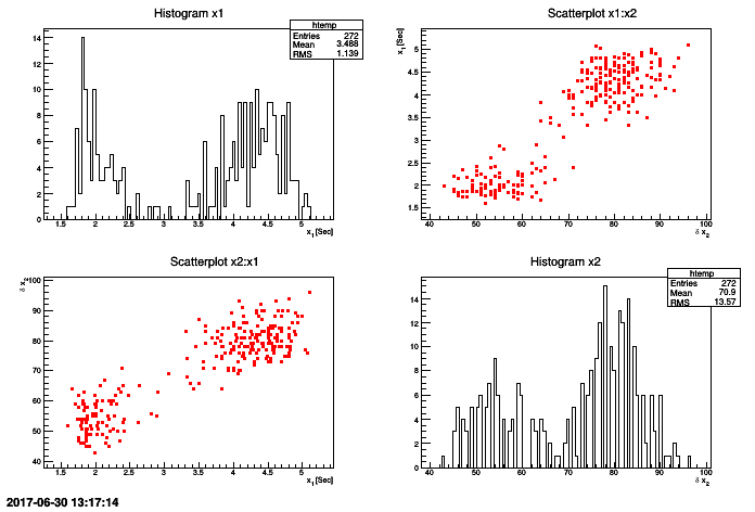
For multidimensional problem, the drawPairs method is limited to spot correlation because of
the way the output looks. For instance in a problem with 8 uniformly-distributed inputs and one output, one can get a
graphic as the one shown in Figure II.50 (obtained with the code below). No special trend
can be seen here.
TDataServer * tdsCobweb = new TDataServer("tdscobweb", "Database of the cobweb");
tdsCobweb->fileDataRead("cobwebdata.dat"); // read data file
tdsCobweb->drawPairs(); // do the drawPairs graph
Figure II.50. Graphs of "drawPairs" type between the 8 uniformly-distributed inputs and the output of a given problem.
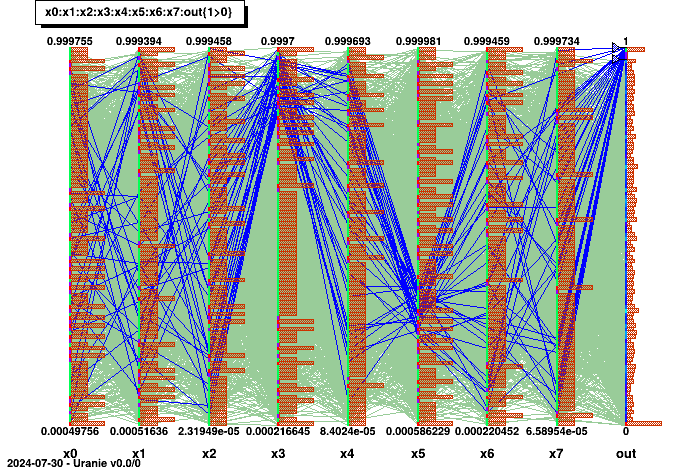
The "CobWeb" multidimensional graph, on the other hand, consists in plotting every dimension on a vertical axis and connecting all the points for a single event with a straight line. It is particularly useful to spot correlation in high-dimension problems as it is simple to highlight a certain region (by changing the colour for instance) to see if the rest of the variable are randomly distributed or not.
// Draw the cobweb plot
tdsCobweb->drawCobWeb("x0:x1:x2:x3:x4:x5:x6:x7:out"); // Draw the cobweb

// Get the parallel coordination part to perform modification
TParallelCoord* para = (TParallelCoord*)gPad->GetListOfPrimitives()->FindObject("__tdspara__1");
// Get the output axis
TParallelCoordVar* axis = (TParallelCoordVar*)para->GetVarList()->FindObject("out");

// Create a range for 0.97 < out < 1.0 and display it in blue
TParallelCoordRange* Range  = new TParallelCoordRange(axis,0.97,1.0);
axis->AddRange(Range);
para->AddSelection("blue");
Range->Draw();
This code for instance specifies a region-of-interest in the output, when the value are greater than 0.97. A correlation is highlighted between these values and a region, for which the fourth input variable has high value while the sixth input variable values lie between 0.2 and 0.4. The result of this code is shown in Figure II.51.
Figure II.51. Graphs of "CobWeb" type between the 8 uniformly-distributed inputs and the output of a given problem.
Warning
This function requires the "mathmore" feature to have be installed along with your ROOT version. If not found, this function cannot be used and will return nothing but an equivalent to this message.
Once dealing with an unknown set of points, it is possible to compare it to known statistical law (among the following already implemented list: normal, uniform, weibull, gumbelmax, exponential, beta, gamma and lognormal). For instance, if one wants to compare "x2" variable from the geyser dataset to a normal law, one can have a look at the quantile distribution from the sample and compare it to the expected behaviour by following the steps below.
TDataServer * tdsQQ = new TDataServer("tdsQQ", "Database of the QQ");
tdsQQ->fileDataRead("geyser.dat"); // read data file
tdsQQ->computeStatistic(); // to estimate mu and sigma
tdsQQ->drawQQPlot("x2",Form("normal(%g,%g)",tdsQQ->getAttribute("x2")->getMean(),tdsQQ->getAttribute("x2")->getStd()),400); 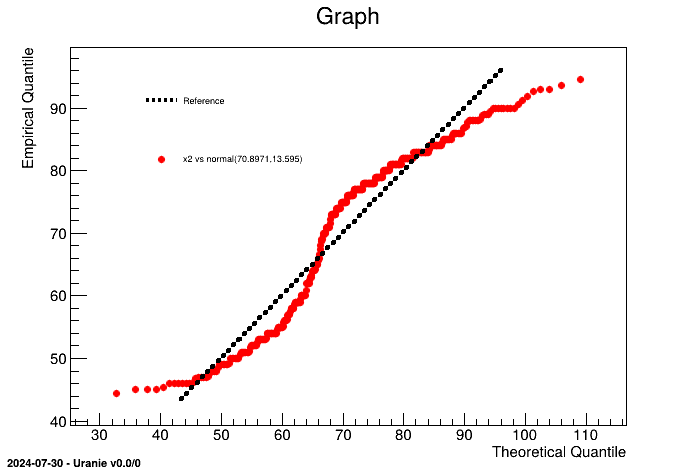
It is obvious here, that the "x2" law, clearly doesn't seem to follow a normal law (which was pretty obvious by looking at Figure II.48 for instance). An heavy use of this method is provided in Section XIV.2.15.
Warning
This function requires the "mathmore" feature to have be installed along with your ROOT version. If not found, this function cannot be used and will return nothing but an equivalent to this message.
Once dealing with an unknown set of points, it is possible to compare it to known statistical law (among the following already implemented list: normal, uniform, weibull, gumbelmax, exponential, beta, gamma and lognormal). For instance, if one wants to compare "x2" variable from the geyser dataset to a normal law, one can have a look at the probabiliity distribution from the sample and compare it to the expected behaviour by following the steps below.
TDataServer * tdsPP = new TDataServer("tdsPP", "Database of the PP");
tdsPP->fileDataRead("geyser.dat"); // read data file
tdsPP->computeStatistic(); // to estimate mu and sigma
tdsPP->drawPPPlot("x2",Form("normal(%g,%g)",tdsPP->getAttribute("x2")->getMean(),tdsPP->getAttribute("x2")->getStd()),400); 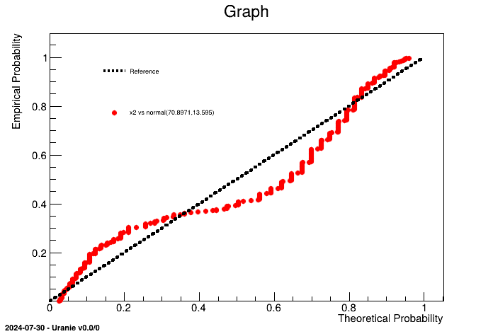
It is obvious here, that the "x2" law, clearly doesn't seem to follow a normal law (which was pretty obvious by looking at Figure II.48 for instance). An heavy use of this method is provided in Section XIV.2.16.
| |  | |
| II.4. Statistical treatments and operations |  | II.6. Combining these aspects: performing PCA |